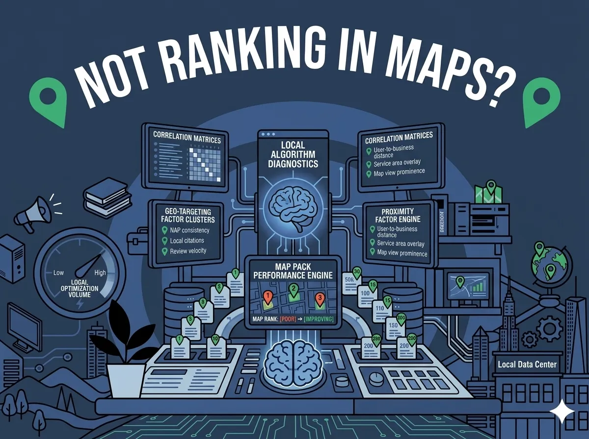
How does your website hold up against competitors in your industry? Poor usability quietly kills your rankings and drives visitors away before they ever become customers. As a Los Angeles SEO agency, we see the same four usability problems show up on site after site — and fixing them can make a real difference in both user experience and search engine performance. According to research, 53% of mobile users abandon a site if it takes longer than three seconds to load (Think with Google). That stat alone should make usability a top priority for any business serious about growing online.
Why Does Website Usability Matter for SEO Rankings?
Google’s ranking algorithms pay close attention to how users interact with your site. When visitors leave quickly or struggle to read your content, search engines interpret that as a signal that your page isn’t delivering value. Good usability and strong SEO rankings go hand in hand — you simply cannot have one without the other.
In fact, research from the Nielsen Norman Group confirms that mobile usability issues remain among the top reasons users abandon websites (Nielsen Norman Group). Improving your site’s usability is one of the most direct ways to improve your SEO rank.
What Is Website Usability and Why Should You Care?
Website usability refers to how easily a visitor can find information, read your content, and complete an action on your site. If your site is frustrating to use, visitors leave — and high bounce rates signal to Google that something is wrong. Think of usability as the foundation that everything else in your SEO strategy sits on top of.
Is Your Website Legibility Costing You Visitors?
Not many things frustrate a visitor more than small fonts or text that won’t resize on a smartphone. This is sometimes called a “frozen” font size, and it’s a usability nightmare on mobile devices.
What Is the Problem With Poor Font Legibility on Mobile?
More than half of all web traffic now comes from mobile devices. If your site doesn’t resize fonts to match the screen being used, visitors will pinch, zoom, and eventually give up. That frustration translates directly into a higher bounce rate and a lower search ranking.
How Do You Fix Legibility Issues on Your Website?
Make sure your site uses a responsive design. A responsive site redraws images and resizes text automatically for each device. If your site gets cut off on the right side when viewed on a phone, it’s likely not responsive. Google moved to “Mobile First” indexing years ago (Google Search Central), meaning it evaluates your site as it appears on a mobile device first. A non-responsive site puts you at an immediate disadvantage.
Is Too Much Text Hurting Your Website’s Usability?
Wall-to-wall text is exhausting. Most visitors scan web pages rather than read them word for word, so dense copy sends them running. A well-known usability study by Jakob Nielsen found that users read at most 20-28% of the words on a web page during a typical visit — a number that reinforces how critical concise writing really is.
What Is the Solution to Overwhelming Web Copy?
Be concise and get to the point fast. Use bold text, bullet points, and subheadings to break long sections into manageable chunks. Write for a broad audience and aim for clarity over complexity. The Readability Test Tool lets you paste in a URL and get scores based on popular formulas like the Flesch-Kincaid Reading Ease scale. Aim for an 8th or 9th grade reading level for the widest possible audience reach.
Here are practical ways to keep copy digestible:
- Use short paragraphs of 2-4 sentences maximum
- Lead with your most important point
- Use bold text to highlight key takeaways
- Break long sections with subheadings
- Use numbered or bulleted lists wherever possible
Does Your Content Flow Logically for the Reader?
Content that jumps around without a clear structure sends visitors away fast. Logical flow isn’t just good writing — it’s a usability factor that affects how long someone stays on your page.
How Should You Organize Website Content for Maximum Clarity?
Think back to the inverted pyramid style taught in high school writing class. Put the most important information at the top, sometimes called the “lead.” Follow with supporting details, and then add related context if necessary. This approach helps your copy flow smoothly and keeps readers engaged long enough to take action. Writing content aligned with search intent is a natural extension of this principle and can significantly improve your rankings.
Are Visually Heavy Layouts Overwhelming Your Visitors?
A page packed with text, images, sliders, and graphics all competing for attention is overwhelming. Visitors faced with visual overload often make a snap decision: they leave.
What Makes a Page Layout Visually Overwhelming?
Too many elements on a page without breathing room creates what designers call “visual noise.” When everything shouts for attention, nothing gets heard. Design elements like hero sliders are a common culprit — they slow page load times, distract visitors, and rarely improve conversions.
How Do You Create a Visually Balanced Web Page?
White space is your friend. Generous margins and spacing between paragraphs and images give readers visual relief. According to a Nielsen Norman Group study on white space, proper use of white space increases reading comprehension by up to 20% (Nielsen Norman Group). A clean, aesthetically appealing page also increases the likelihood that visitors will share your content on social media, which carries its own SEO benefits.
For more on how on-page elements affect your performance, see our guide on common on-page SEO mistakes that cost you traffic. It’s also worth reviewing your Core Web Vitals scores, since Google uses them as a direct ranking factor tied to user experience. And if your content needs a refresh, our post on keeping visitors engaged and boosting rankings covers the fundamentals in detail.
If you’re a business owner in Southern California wondering whether your site is holding you back, our team as a trusted LA SEO company can audit your site and identify exactly what’s costing you rankings and customers.
Your website’s usability is one of the most powerful levers you have for improving your SEO rankings. The good news is that these issues are fixable. A responsive design, concise copy, logical structure, and clean visuals can transform how visitors experience your site and how Google ranks it. If you want help identifying and fixing the usability problems dragging your site down, our Los Angeles SEO agency team is ready to help. Contact us at https://go-seo.com/contact-seo/ to schedule a free discovery call and find out exactly where your site stands.
Frequently Asked Questions About Website Usability and SEO
How does website usability affect SEO rankings?
Google tracks how users interact with your site, including bounce rate, time on page, and mobile experience. Poor usability causes visitors to leave quickly, which signals to Google that your page isn’t delivering value. Improving usability directly supports higher search rankings over time.
What is responsive web design and why does it matter?
Responsive web design means your site automatically adjusts its layout and text size to fit any screen, from desktop to smartphone. Since Google uses mobile-first indexing, a non-responsive site will rank lower in search results. Most web users now browse on mobile devices, making responsiveness essential.
How can a Los Angeles SEO agency help improve my website’s usability?
A Los Angeles SEO agency will audit your site for usability issues including mobile responsiveness, font readability, page load speed, and content structure. They then implement targeted fixes that improve both user experience and search rankings. The result is more traffic, lower bounce rates, and more conversions.
What reading level should website content be written at?
Most SEO experts recommend writing at an 8th or 9th grade reading level. This keeps content accessible to the widest possible audience and reduces the cognitive load on readers. Tools like the Flesch-Kincaid Readability Test can measure your content’s reading level quickly.
What is white space and why do web designers recommend it?
White space refers to the empty areas around text, images, and other page elements. It gives readers visual relief and helps the eye focus on what matters. Research shows that white space can increase reading comprehension by up to 20%, making it a usability best practice.
How does working with an LA SEO company help small businesses compete online?
An LA SEO company brings local market knowledge combined with technical SEO expertise to help small businesses rank higher in competitive searches. They identify usability and technical issues that hold your site back and implement proven strategies to increase organic traffic. For small businesses with limited marketing budgets, SEO often delivers the highest return on investment of any digital channel.
Ready to find out how your site’s usability is affecting your search rankings? Our team at GO-SEO specializes in identifying exactly what’s holding your website back and building a clear plan to fix it. Contact us at https://go-seo.com/contact-seo/ or call +1 800-419-3730 to get started.